Lindkvist & Sten
Year
Year
2026
2026
Project type
Project type
Branding, Brand Communication, Website
Branding, Brand Communication, Website
Industry
Industry
Law
Law
Status
Status
Concept
Concept
Lindkvist & Sten is a boutique law firm based in western Sweden, specialising in business law, contracts, and real estate transactions. Founded over a decade ago, the firm had built a strong local reputation through consistent, high-quality work — but had never invested in a considered brand identity.
Their existing visual identity had been assembled piecemeal over the years: a logo designed early on, a website built later by a different provider, and printed materials that followed neither. Nothing was actively wrong — but nothing worked together.
Lindkvist & Sten is a boutique law firm based in western Sweden, specialising in business law, contracts, and real estate transactions. Founded over a decade ago, the firm had built a strong local reputation through consistent, high-quality work — but had never invested in a considered brand identity.
Their existing visual identity had been assembled piecemeal over the years: a logo designed early on, a website built later by a different provider, and printed materials that followed neither. Nothing was actively wrong — but nothing worked together.

The Problem
The Problem
Clients consistently praised the firm's expertise and personal attention once they became clients. The issue was earlier in the relationship: prospective clients researching the firm online formed a different impression than the one the firm actually delivered.
The identity looked generic — closer to a template than a considered mark. The website's domain didn't clearly reflect the firm's name, a detail that had happened organically years earlier and never been revisited. Typography, colour, and tone varied across the website, letterheads, and case documentation, with no shared system tying them together.
For a firm whose entire value proposition rests on trust and precision, the inconsistency was doing quiet damage — undermining exactly the qualities the firm was best known for internally.
Clients consistently praised the firm's expertise and personal attention once they became clients. The issue was earlier in the relationship: prospective clients researching the firm online formed a different impression than the one the firm actually delivered.
The identity looked generic — closer to a template than a considered mark. The website's domain didn't clearly reflect the firm's name, a detail that had happened organically years earlier and never been revisited. Typography, colour, and tone varied across the website, letterheads, and case documentation, with no shared system tying them together.
For a firm whose entire value proposition rests on trust and precision, the inconsistency was doing quiet damage — undermining exactly the qualities the firm was best known for internally.


The Approach
The Approach
The engagement started with strategy, not design. Before any visual work began, we worked with the partners to articulate what the firm actually stood for: direct, precise, personally invested — the opposite of a high-volume, transactional legal practice.
This became the foundation for a clear positioning statement and a set of brand principles the partners could use to evaluate every future decision, not just this one.
Only once that foundation was in place did the identity work begin.
The engagement started with strategy, not design. Before any visual work began, we worked with the partners to articulate what the firm actually stood for: direct, precise, personally invested — the opposite of a high-volume, transactional legal practice.
This became the foundation for a clear positioning statement and a set of brand principles the partners could use to evaluate every future decision, not just this one.
Only once that foundation was in place did the identity work begin.

The Solution
The Solution
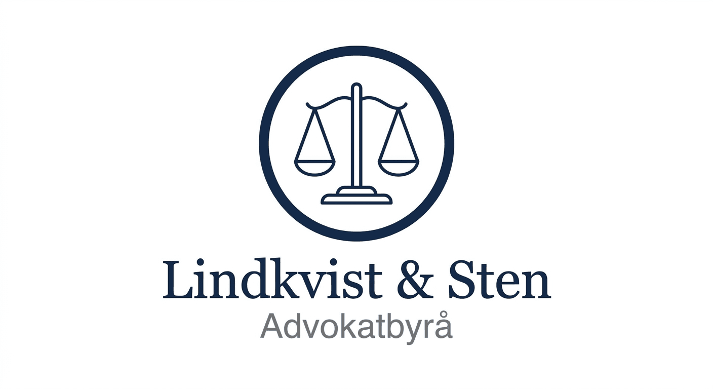
The new identity centred on a restrained, typographic wordmark — deliberately understated, reflecting a firm that lets its work speak rather than its branding. A structured, editorial layout system was developed for use across the website, case summaries, and printed materials, built around a small, consistent colour and type palette.
A full set of brand guidelines was delivered alongside the identity, giving the firm a reference for consistent use across every future touchpoint — from business cards to court filings to their website — without requiring a designer's involvement for routine decisions.
The domain and firm name were also aligned, closing the gap between what the firm was called and where clients found them.
The new identity centred on a restrained, typographic wordmark — deliberately understated, reflecting a firm that lets its work speak rather than its branding. A structured, editorial layout system was developed for use across the website, case summaries, and printed materials, built around a small, consistent colour and type palette.
A full set of brand guidelines was delivered alongside the identity, giving the firm a reference for consistent use across every future touchpoint — from business cards to court filings to their website — without requiring a designer's involvement for routine decisions.
The domain and firm name were also aligned, closing the gap between what the firm was called and where clients found them.

The Outcome
The Outcome
The result is a firm whose first impression now matches the experience clients actually have once they walk through the door: precise, considered, and quietly confident rather than generic.
Internally, the brand guidelines have removed the guesswork from day-to-day materials — new documents and communications now follow a clear system rather than being recreated from scratch each time.
The result is a firm whose first impression now matches the experience clients actually have once they walk through the door: precise, considered, and quietly confident rather than generic.
Internally, the brand guidelines have removed the guesswork from day-to-day materials — new documents and communications now follow a clear system rather than being recreated from scratch each time.

Got a project in mind?
From crafting unique brand identities to designing intuitive websites and valuable content, we're here to execute your ideas. Contact us, and let's discuss your project.

Hampus Blomdahl
Founder & CD
Got a project in mind?
From crafting unique brand identities to designing intuitive websites and valuable content, we're here to execute your ideas. Contact us, and let's discuss your project.
Hampus Blomdahl
Founder & CD
Got a project in mind?
From crafting unique brand identities to designing intuitive websites and valuable content, we're here to execute your ideas. Contact us, and let's discuss your project.
Hampus Blomdahl
Founder & CD